
How do I add a Squarespace accordion block to my website?
More good news for the DIY website builders! Squarespace accordion blocks are now a feature of the main menu panel! A really useful feature that requires NO coding!
The accordion block is a great way to display FAQ’s and interviews without having an overwhelming text heavy page. Let your audience pick and choose what information they would like to expand upon without filling the page and camouflaging content.
Previously, code was required to add this feature, but now it’s as easy as adding a text or image block to your section. The font types can be updated to suit your style, colour changed as per the section theme, and you have the choice of either an arrow or + sign for the drop down icon.
Follow the simple steps below, or watch the short video tutorial to learn how to add an accordion dropdown menu to your website!
-
FAQ’s is the most popular way to use this feature, but it can be used wherever you would like text to be expandable. For example interviews, subjects, menu’s, price lists…
-
No! It is available on all price plans!
-
Yes! Just follow the steps below, or watch the quick video at the end of the page.
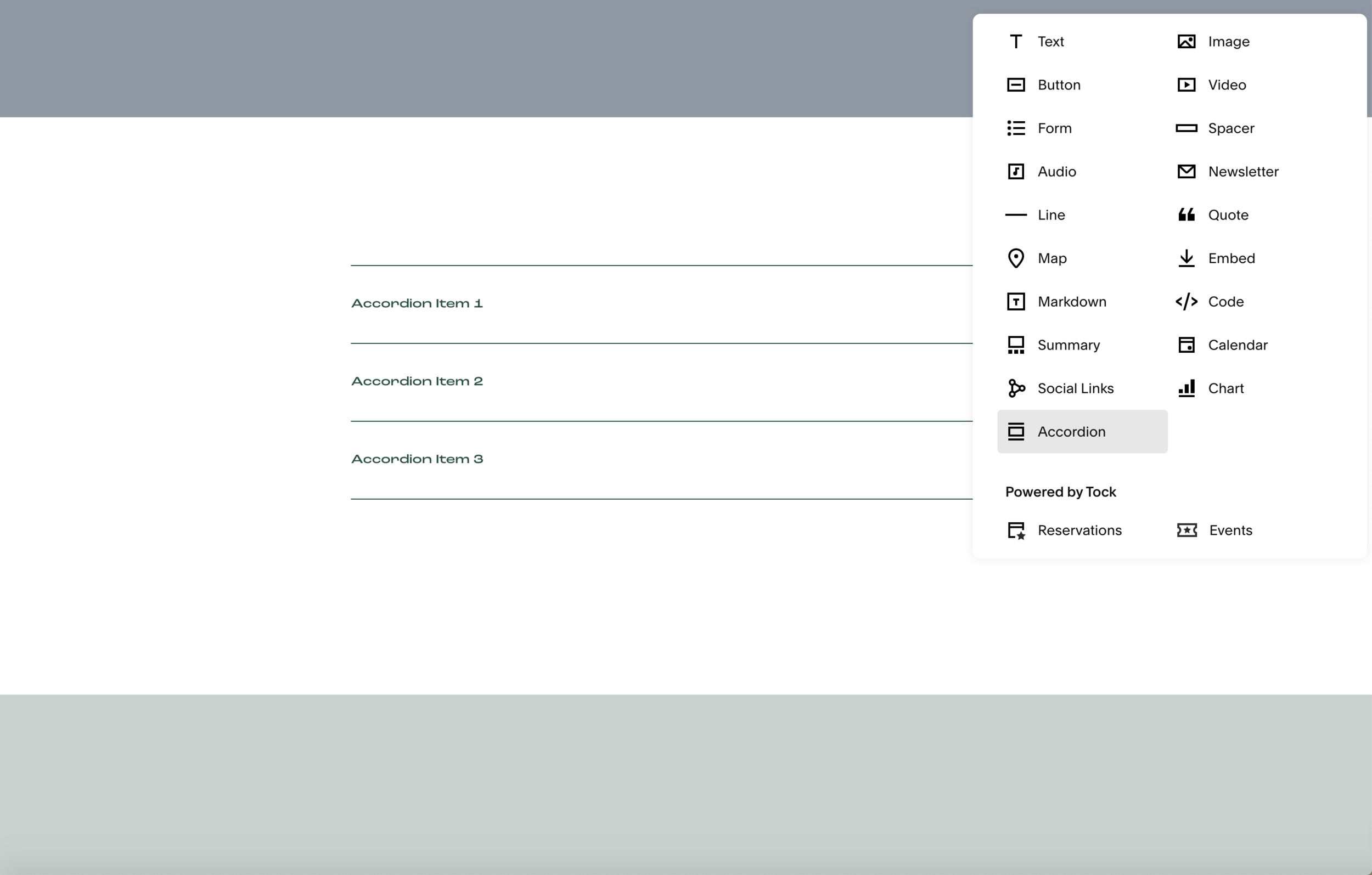
Add Squarespace accordion block
Add a new block to your section and choose “Accordion” from the menu panel. Place your accordion block in its own section if you would like to play around with the font and background colours without affecting other elements within that section. The divider line and drop down icon colours can be changed within the colour style panel in ‘Site Styles’.
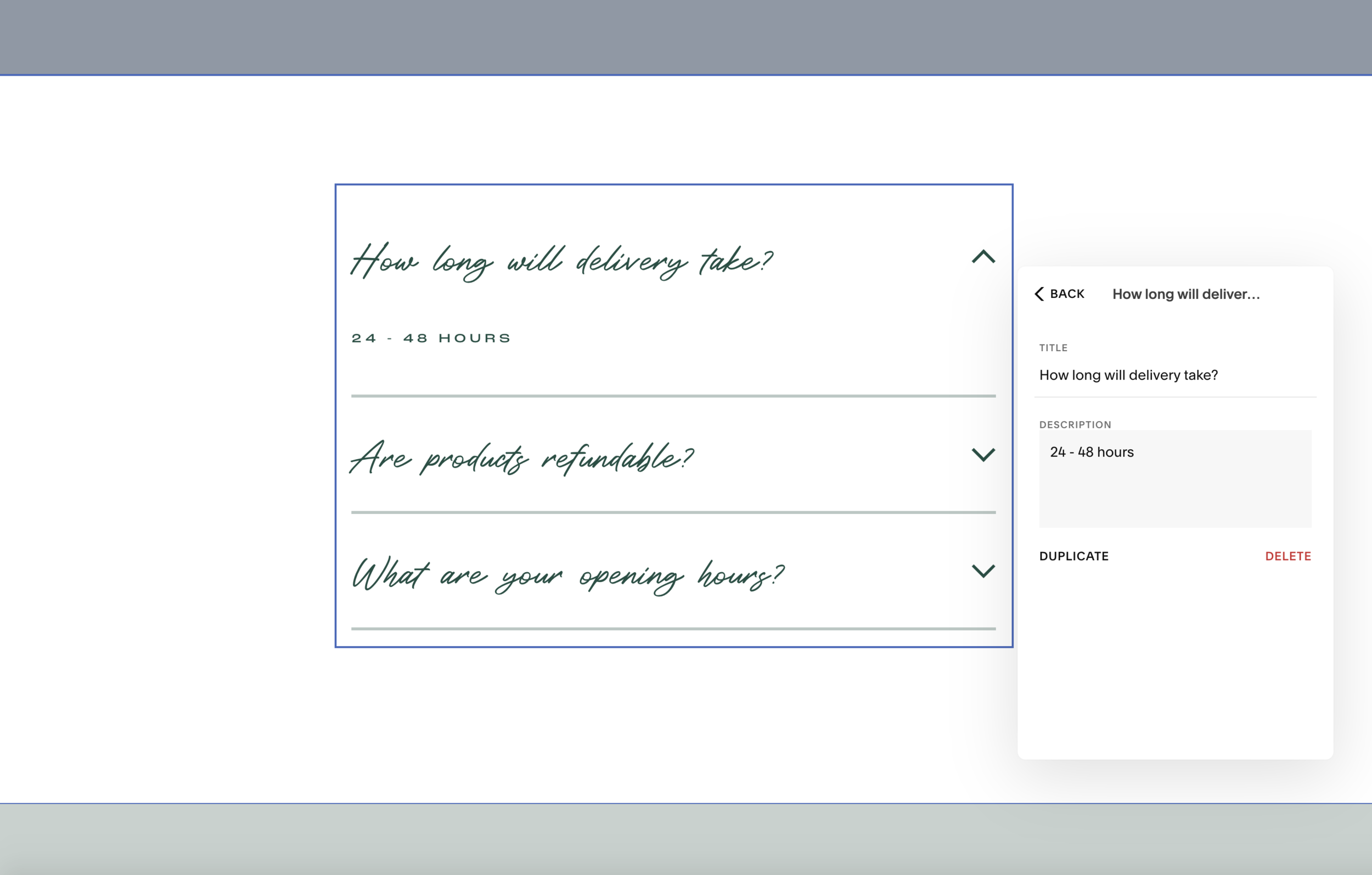
Style Squarespace accordion block
Style your accordion drop down box. Start by adding in your questions and answers, or text elements. The title will always be visible, and the description is what can either be hidden or expanded. There will be three placer questions by default, but you can add or remove as needed.
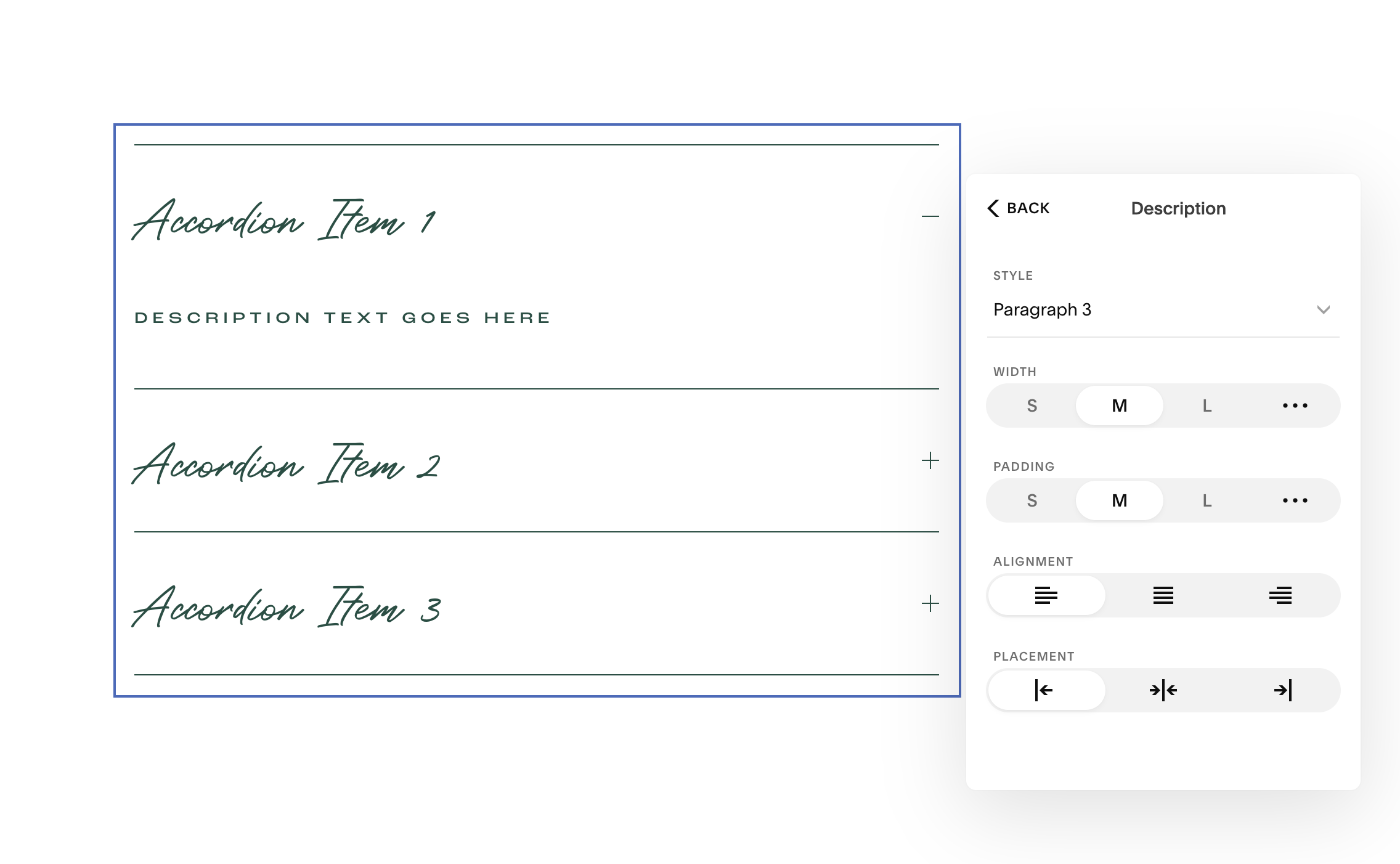
Once your text has been inputted, decide on the font style for the title and description by clicking on the ‘Design’ tab. The font styles available are the same as those used across your website (h1, h2, h3, p1, p2 etc). As seen in the image on the right below, you can also change the width, padding, alignment and placement of text.
Below ‘Text’ on the design tab, you will then see the other aesthetic elements that can be changed. Including the divider lines and drop down icon. For the divider lines you can choose if you would like these visible, and if so which ones. The thickness and opacity can then be altered to suit the look and feel of your website page. With the drop down icon you have the choice of either an arrow or + sign. The position, size and thickness of the icon can also be changed to suit your style. As mentioned before, the colour of both of these elements can be changed within the colour theme area of your ‘Site Styles’.


