
How to customise the design of your mobile menu navigation on Squarespace
Prior to launching your website it’s important to check how it looks when viewed on a mobile. Part of this process is to check the design of your menu panel as it has a different layout to the desktop version.
Make sure that the text can be read easily, and the links have enough spacing around them to make clicking fuss free (remember on a mobile you tap with your fingers rather than a precise computer mouse). As well as changing the colour, you can adjust the layout and switch the menu icon.
I like to use a contrasting colour theme on the mobile menu panel to grab the viewers attention and make it super obvious that something needs to be actioned.
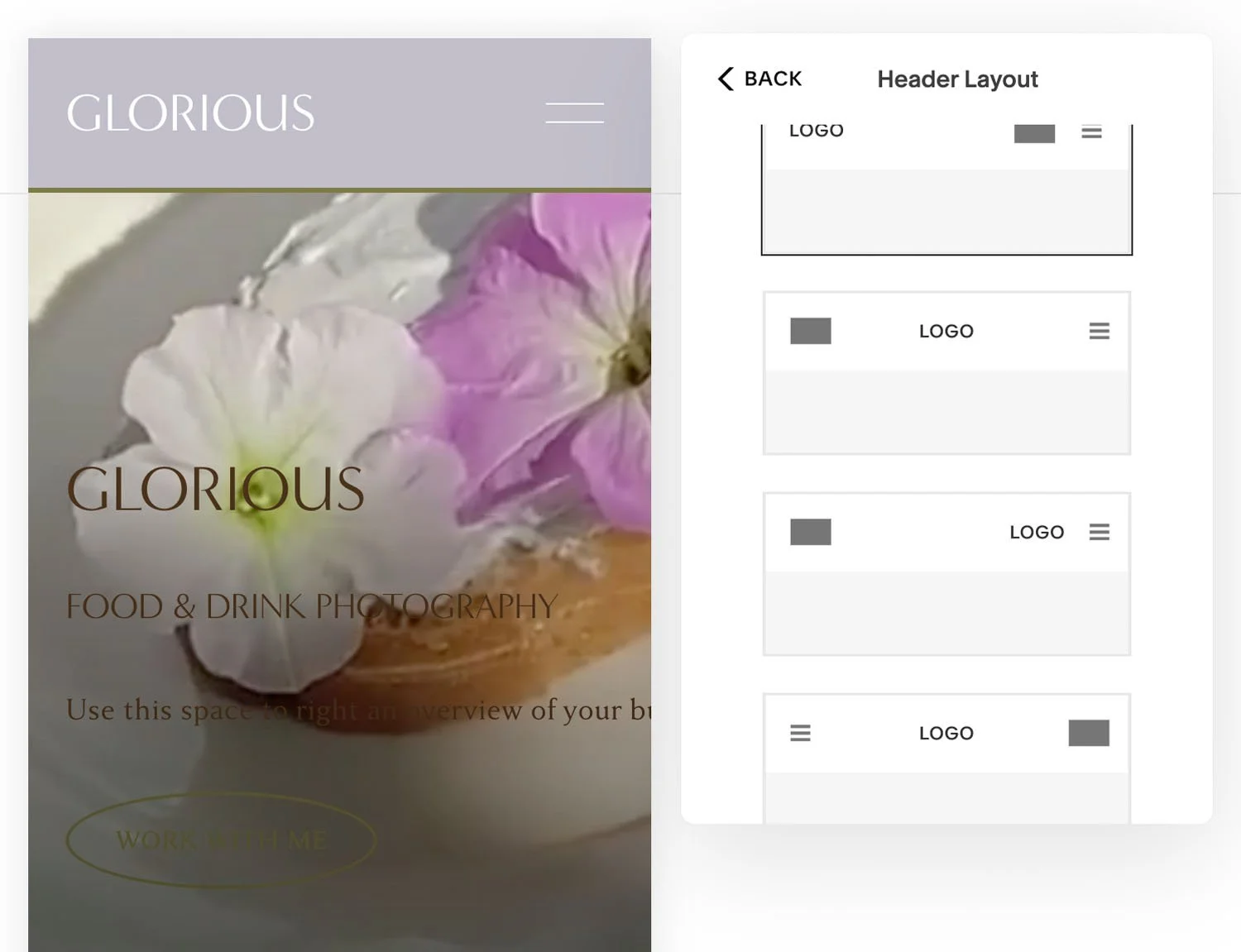
Change the header layout
As with the desktop view, you can adjust the layout of the mobile view site header. Choose where the logo and menu icon are positioned, and change the style of the menu icon as needed.
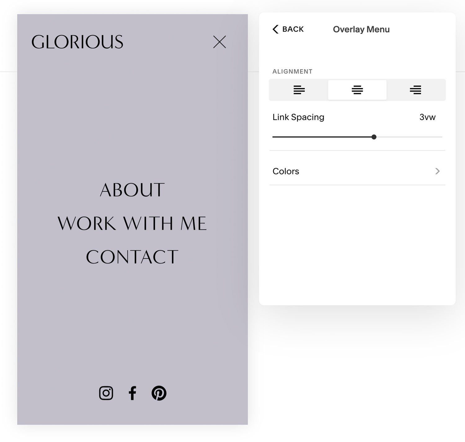
Customise menu pop up
Change the appearance of the background and text by switching the colour theme. Adjust the link spacing, and alter the text alignment to suit your style.


